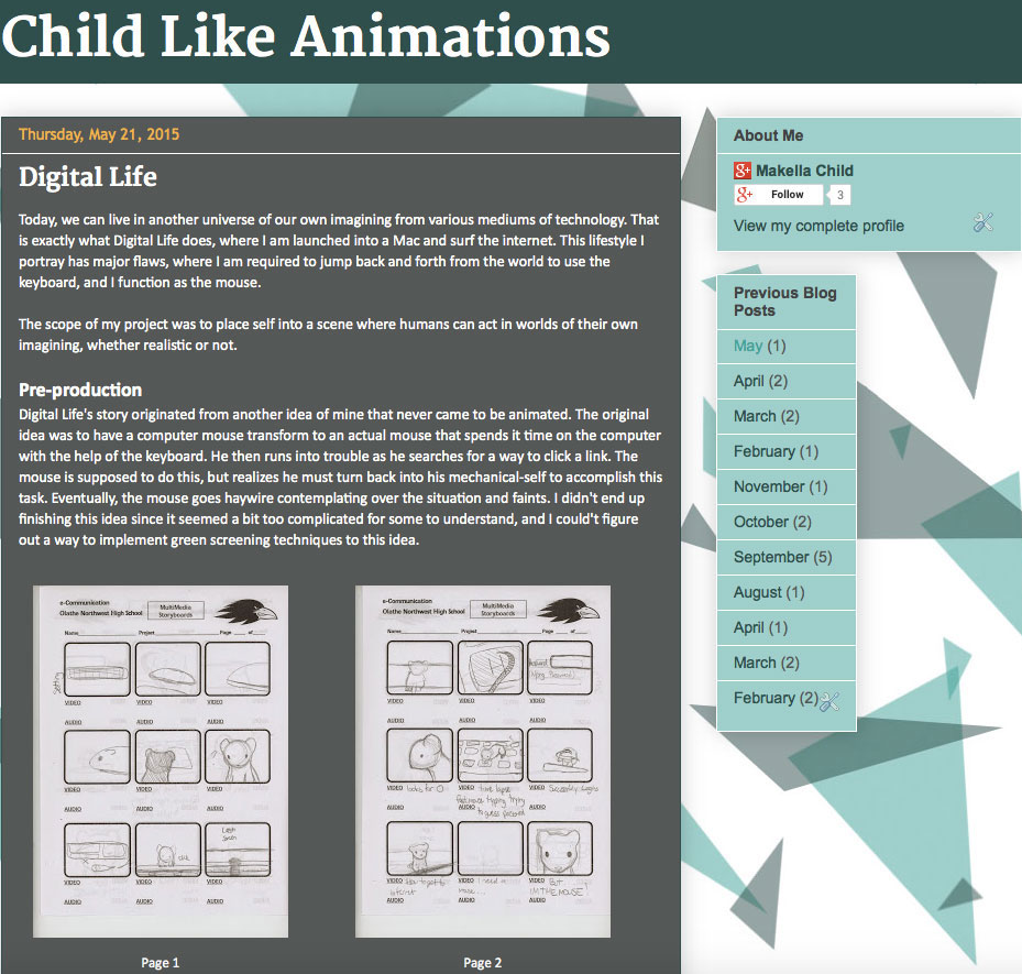
A new school year has approached, and I decided to change my blog's year old layout to something fresh. With this new layout, I decided to do an evaluation on both designs and compare them to how much I have improved, and steps I took to achieve my new layout.
BEFORE
AFTER
BACKGROUND AND COLORS
 |
| Seamless Triangle Background |
The most significant change I have made to my blog would be the seamless triangular background. This design was based off of an example I found from
Paletton while figuring out my color scheme. Below is the example of the image provided from
Paletton. Even though the colors are different, any viewer can understand the concept of my idea from this image.
Click on the example image to get a link to the original color scheme. In order to get these exact colors, you would have to change the color simulation to Trianotia, then go to examples and click on Shatter Effect.
 |
| Custom Made Brush |
In order to make my own triangular pattern, I made a custom made brush with abstract triangles from
this tutorial. I then resized and rotated the brush several times for each color, then offset the background and cleaned up small areas to get my final background image.
 |
| Color Palette |
Like the Paletton image, I modified my background image with some slightly off-shade colors. I stuck to my teal and gray theme with main color as aquamarine. My dark colors consist of a dark teal and a dark gray hue; my light colors consist of an ice blue hue from my background, and a contrasting creamsicle orange color.
FONT
 |
| Blog Title |
Before my blog makeover, I didn't do that much experimenting with fonts. I mainly stuck to well known sans-serif fonts like Veranda and Trebuchet because that was what I like best. That changed when viewing some images on Pinterest which combine serif and sans-serif fonts. I found them to be very appealing-more than my blogs' fonts, and applied that practice here.
 |
| Blog Text Sample |
I changed my font styles. I used Georgia for the Blog title and Post title, Trebuchet for the Date Header, and Arial for the Gadget Title, Gadget Text, and Post text.
Along with fonts came with what color should the fonts be and where. I chose white for my post text and title, with orange for my date header. For links, orange was used as my link hover color for all parts of my blog(except the footer). Depending on where a link was located, the actual link color (whether visited or not) varies.
LAYOUT
 |
| Original Blog Layout |
From comparing the new designs to your left, you may notice that the sidebar has been set to transparent, giving the blog a softer feeling. The sidebar background color has changed to the aquamarine color from my color palette with the dark teal and gray used for fonts. The title text is now larger with the help of the serif font. The blog template has also changed, especially with the date header being shifted to the center and not on the top right corner with a text bubble border.
 |
| New Blog Layout |
MOBILE VERSION
 |
| Original Mobile Version (Home) |
 |
| Original Mobile Version (Blog Post) |
Along with the desktop changes comes the layout of the mobile version of my blog. Here are screenshots of my blog taken from my phone, with the original version on top, and the new version below. Like the desktop version, the blog title now appears bolder and thicker than ever, which draws in the users eye. I also like the contrast with the separate blogs and the teal text for each post title, giving my new layout a sort of hard look. What contrasts the hard gray color comes the soft barely noticeable background, something I wish would be shown more on the mobile version. Compared to the desktop version, I find the mobile version to be quite slick and exquisite, probably because of the thin screen dimensions and simple layout.
 |
| New Mobile Version (Home) |
 |
| New Mobile Version (Blog Post) |
FINAL THOUGHTS
In short, my blog has been redesigned to be more personalized and appealing for those looking for a sample blog on the kind of work I do. There is plenty of room for improvement on this blog, but I believe it looks astounding, especially with my previous design and how much I have improved.
Everything has been set but my blog's favicon, which will be changed soon when I figure out a new "logo". An update will be made when that favicon has been changed. I will then evaluate the changes on a separate blog post. In the mean time, enjoy the new blog design!