Thursday, October 9, 2014

ONW NOW FINAL CHANGES

After having my project evaluated by my teacher, he noted a major change that needed to be made. He stated that the compass had to be changed because since the project was made to represent e-Communication, not the whole school, the compass had to be replaced with the e-Comm logo, as shown below.

Here is the e-Comm logo, which replaced the compass for this project. (The white appearing inside of the E wasn't shown on the composition.)

As I placed the logo on the composition, I noticed some problems with the image, and decided to play around with some border effects for the logo.


My first idea was to give the logo a black border. I made it by changing the color hue to black and slightly scaling it up to a thin layer. The result of that is shown below.

I merged the two layers together, placing the black border behind the blue logo, which I think is nice.


Another experiment I did was on the composition, I made a white border around the E to put focus on the logo. This didn't turn out to be my final idea because the white border was overwhelmingly bold and shifted the focus away from the logo.


As you can see, the white border overpowers the logo, and doesn't look very clean.


For my backup plan on the border, I proposed the idea of having a faded border, created using the Glow Effect with the original colors placed.


After the different tests run, a final product was made with the guidance of my animation teacher, who pointed out the flaws the details provided to the project.


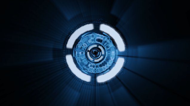
One idea he thought of was that since the compass was covering up the spinning effect, he suggested that I should zoom into the center of the project, and make the e-Comm logo jump out.


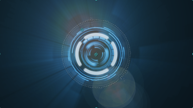
Through this transition, the spinning layers' opacity decreases, and the logo's opacity and size increases. Optical Flares is also added to brighten up the fading layers.

The Optical Flares continues on and slowly dims away to nothing, matching the audio fading away.


The last sound effect made is put into motion with a blue glow, where it's intensity increases, and goes back to normal, ending with the whole composition fading to black.


These final details changed the whole purpose of the animation, where attention is placed on the many details that form this big picture. Though there were times I had uncertainty on what editions had to be included, having another set of eyes improved my thoughts on animating and the outcome of the animation as a whole.

Here is the final render of the ONW NOW Ending. Enjoy!


ONW NOW PROJECT EVALUATION

Yesterday, I got my animation project evaluated in class. I presented my project infront of the class, summarizing how the project was created with specific details and steps made, along with my personal thoughts and struggles of the project. I received some good feedback about the project from my teacher, which wasn't expected of me.

One compliment received with my project was  the arrival of the compass. When it comes to the screen, the compass jumps, and slightly decreases in size, creating a smooth transition.


My teacher also liked the small glow texture shown here. It quickly appears at the peak of the animation, where the compass is at it's largest scaling point, or greatest size.


Another compliment received from me was the great timing with Optical Flares. I felt relieved about that compliment since it was my first time using this plug in.

Within my other classmates, not many commentary was given, but all the feedback received was positive.


Despite the positive comments given, there were mistakes made in my project. One of them was that since the compass popped up on the animation and covered up the original project, there was a sense of emptiness given with my original project. My teacher told me he will talk to me about alternative transitions that could be made to close this gap.


Tuesday, September 30, 2014

ONW NOW ENDING FINAL UPDATE

Today is the day, that I have finished my project. Because of this accomplishment, I can now explain my final steps using the wonderful Optical Flares, and evaluate my project with Video.

Here are some screenshots of the Optical Flares effect, available on Video Copilot. In this effect are multiple options of how you can make your optical flares appear, but I chose the default one because it best fitted the animation.
This is my first optical flare shot, where the intensity is increased, and creates a blue background. I like this optical flare because it introduces the effect by flashing it's light out and making the audience feel excited about the rest of the animation.
The second optical flare shot was slightly dimmer, but had a large outer glow in the background. The way I set each optical flare, by brightness, radius, and direction of motion is set up to match the audio.

The third optical flare has a small radius but strong intensity. It moves diagonally across the panels like a flickering firefly. The optical flare may be short in time length, but it adds a sense of syncopation.

This is the last optical flares shot, where the light is shined at the center of the composition to make it appear come out of the panels. It started out with a huge flash, then dimmed out to a tiny speck.


Here is the optical flares combined with the original animation. They both look good together because of the blue color scheme, glowing light effects, and syncopation with the audio.


While making the optical flares, I encountered some problems, like the opacity. I originally wanted my optical flares to decrease in opacity and not appear when the beat didn't sound. This lowering of opacity formed a light blue background from the Optical Flare's brightness. This really confused, and then solved the issue by turning the brightness all the way down when I didn't want it to appear.


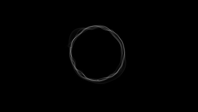
Along with the creation of Optical Flares, I made an outer ring for the panels. Why? From the original animation shots, the outside looked very odd, and was missing something on the outside to fill this emptiness. I then filled it with an outer ring by making two circular masks. The outer mask was set to add, and the inner mask was set to subtract to get rid of the unwanted space. I then moved this layer to the Adjustment layer to match the color scheme, which turned out amazing.

Now that I have explained all of the final detail of the composition, everything is merged together and looks nice. Here is the ring put together with the whole composition, which by viewing it, does fill an empty gap that was placed before.


Over the past month or two, I have made the ONW NOW Ending, using the Advance Spin FX on Video Copilot. My original plan for the project did not come out as planned, but these adjustments made the project great. Overtime, I did get tired of watching the tutorial, but I persisted in the hard challenges when I couldn't understand material from the tutorial. The tutorial felt long and tiring, but  felt more energized the quicker I worked through the animation.

If you enjoy working with After Effects, this would be a great intermediate level project to work on, since it teaches many tricks on After Effects and improves your After Effects skills.

Here is the animation I rendered out. Note that this isn't 100% done, and changes will most likely occur as my work progresses.


Thursday, September 25, 2014

ONW NOW ENDING UPDATE 2

This past week of wrapping up the ONW NOW Ending Project has been full of incorporating additional details that play a big role of determining the feeling of the project as a whole. My last update concentrated on the foundation of the looks, but this update will continue onto the secondary parts of the project, as I follow the Video Copilot Tutorial.

The next major step of the video tutorial after compiling the rendered compositions together, was to create white circular panels. I began the creation of these panels by making a white square, and adding a fast blur.
I then duplicated the square three times, added a wiggle lighting effect, which randomizes how often the square will blink. I also aligned the squares parallel to each other with the align layers tool. This new feature to me was very helpful for me since I like my objects straight in order.
My next major step was to add the polar coordinate effects to the squares to form the panel. I then set the conversion to "rect to polar", and increased the interpolation all the way to 100 percent.
After completing the panel, I duplicated it, scaled it to the outside, added glow and tint effects for appearance, and rotation expressions so the panels may rotate like the other compositions.
After testing the background color using color collection and curves, I played with the alpha, red, blue, and green channels to match ONW's raven blue color, as shown on their website below.


Animating with the Bulge effect was tough. I encountered problems with the bulge as it scaled down. Here below are some screenshots of the various bulge conflicts.


One thing that bothers me about the Bulge effect as it scales down is that it leaves traces of feathery ends in the outer panel.
The problem occurring here as the bulge moves is it touches the middle electrical layer. As that happens, the bulge layer creates a water effect, which I happen to find to be very "electrifying" (pun intended).


I took a break from animating the whole project, and decided to add in electric layers on the inside of my project.I constructed them by copying my original composition, and made different changes to each composition.
Significant changes like the force motion blur effect and multiple frequency spheres were used. The audio was also changed because the audio for the final project has been used multiple times, and I don't want these projects to match that audio.
The bottom one is very hard to see because of it's very low opacity.

Animating the projects was very complicated. I had to match keyframes with the audio,which is a very lengthy process. I do love how After Effects displays the frequency bands for the audio, a useful guideline of where to place keyframes. Effects that were edited with keyframes include the opacity, rotation, and scaling. Doing this taught me how to animate with audio and keyframes.


This is a screenshot of what the composition looks like without the compass logo, as mentioned in my previous blog post. The process was time consuming, but at the end, all of the layers flowed well together.


My major challenge was getting the panels to rotate with keyframes,since they were set to rotate with an expression, and had to manually delete the expression and replace the rotation with keyframes.
The last major step I need to make is to add in Optical Flares with the help of a senior experienced with this effect.


I only have a few days left to finalize the project, and get it to the best of it's ability. My goals to be completed are to meet with Video and evaluate the project. I also plan on meeting with one of the seniors who did this project in the past and let him judge what changes need to be made.

Wednesday, September 24, 2014

ONW NOW LOGO PROGRESSION


For the past few days, I have thought about ideas for the ONW NOW Logo for my project. So I thought that it would be a good idea to blog about it.


My first thoughts of planning out the logo, was to do something related to ONW and the raven mascot. I then googled some raven logo ideas, and thought this image would be a good example. I would use the text,"ONW NOW", and incorporate a raven shilouette on the letter W.
This idea made me think of eCommunication's "eMagine Festival", an annual event at Olathe Northwest where schools across the metro area meet and compete against all of the school's finalists on projects pertaining to graphic design, web design, animation, and video. The most successful logo concept for this event is the raven and the branch, where the raven represents ONW, and the branch represents each strand, which connects together in a tree.


After some reflection, I realized that this idea did not fit my project. I then came across the school's compass logo, as shown to the left, and appreciated this idea. The compass logo works out very well for the ONW NOW Ending project because of it's circular shape, similar color palette, and the three radii  present, which looks similar to the multiple circular layers in the original project.


Here is a screenshot of the compass covering the spinning layers. Added details like the frequency bars appeal to me because they move up and down to the sound effects. The glowing navy blue background emphasizes the movement of the compass and it's points. Also, since the compass is the main focus right now, it shows how important ONW is compared to all of the other details placed in the project. 


After this experience of planning the logo that will be placed in my project, I have learned that things don't always go as originally planned, and that I sure do prefer this plan over my original plan of meeting with the Graphic Design and Video teams to discuss this. It would also help save some headaches because both groups are busy this week for helping out with Homecoming events this week.

Wednesday, September 17, 2014

ONW NOW ENDING UPDATE

Over the past two weeks, I have worked on my project for animation, the ONW NOW Ending. More information about the beginning stages of creating this project are posted in the post below.

On Video CoPilot, I have watched the video tutorial and followed the steps given. The video required me to make multiple compositions, something new to me because on past projects, I would do all of my work under one composition.

The first composition I made involved converting an audio to an audio frequency line, called an Audio Spectrum.That spectrum was then made to a circle with a mask. I then copied the mask and added effects to it like digital lines, analog lines, and analog dots. Scaling and repositioning to the other masks were added and adjusted to change the appearance.


 This kind of process was done to all of the compositions, and given different looks. For the second one, the outer line was given the Force Motion Blur, to have that lowered opacity feel with added lines. Another effect included to the audio spectrums is which way the frequency bars go up and move. These bars can either stick out on the inside, outside, or both sides of the circle, as shown on the middle circle here.

The next two compositions involved working from scratch, without the original audio used in the last compositions. I added in the Vegas effect, which lets a line circumnavigate a mask. Added effects were also edited, like the number of segments, or lines, are circling the perimeter, and the length, thickness, and opacity of these segments.


This last composition included all but one effect as mentioned before, called the Stroke effect. This effect originally makes a circular path of dots. I then combined these lines with one of the layers with the Vegas effect, and edited them to give a different feeling for the moving lines.


I then converted all of the compositions above to a Quicktime Movie, imported them to a new composition, merged, and edited the files to fit the tutorial. What was then resulted was this, which I thought turned out very well. All I need to do now is add color, glowing effects, and to animate it!